As a presentation designer and pitch deck expert, I understand the paramount importance of a well-structured and visually appealing PowerPoint presentation. A critical aspect of achieving this is by creating a master slide template. A master slide template provides a standardized format and design for your slides, facilitating efficiency and consistency while allowing you to concentrate on delivering impactful content. In this comprehensive and detailed step-by-step guide, I’ll walk you through the process of creating a master slide template in PowerPoint, enabling you to elevate your presentations to a professional level.
Step 1: Understanding the Significance of a Master Slide Template
Before diving into the technicalities, let’s understand why a master slide template is crucial. A master slide template is the backbone of your presentation design. It allows you to define the look and feel of your presentation, ensuring consistency and professionalism throughout. By creating a master slide template, you streamline the design process, save time, and maintain a cohesive visual identity across your slides.
Step 2: Plan Your Presentation’s Design Approach
Design is a pivotal element in any presentation. Before diving into PowerPoint, take some time to plan the design approach for your presentation. Consider your brand guidelines, target audience, and the message you want to convey. Decide on the color palette, typography, and overall aesthetic that aligns with your branding and objectives.
Step 3: Gathering Design Assets
To begin creating your master slide template, gather all the necessary design assets. This includes logos, images, icons, and any other branding elements that you’ll incorporate into your presentation. Ensure that these assets are high-resolution and fit the design guidelines you’ve established.
Step 4: Launch PowerPoint and Open a New Presentation
With a clear design plan and assets in hand, launch Microsoft PowerPoint and open a new presentation. Begin with a blank slate, setting the stage for creating your master slide template.
Step 5: Access Slide Master View
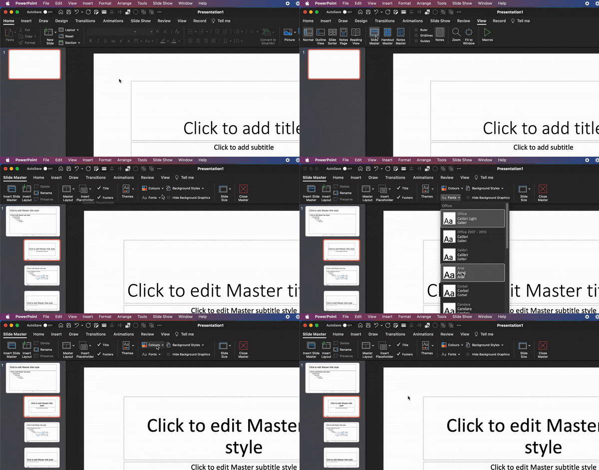
Once your new presentation is open, access the Slide Master view by navigating to the “View” tab in the PowerPoint ribbon and clicking on “Slide Master” in the “Master Views” group. This view is your canvas for designing the foundational elements of your presentation.
Step 6: Understanding Slide Master Layouts
In the Slide Master view, familiarize yourself with the main slide master layout at the top and the individual layouts for titles, content, and other slide types beneath. Each layout corresponds to a specific type of slide in your presentation. Customize these layouts to suit your design requirements.
Step 7: Customize Slide Master Layouts
Now comes the creative part. Customize the slide master layouts by adjusting fonts, colors, backgrounds, placeholders, and any other elements you wish to standardize throughout your presentation. Keep in mind the design plan you formulated earlier, and aim for a consistent and visually appealing layout.
Step 8: Adjust Fonts and Typography
Font selection and typography are crucial for visual consistency. Choose fonts that align with your brand and message. Define font styles for headings, subheadings, body text, and other elements to maintain a cohesive and professional typographic hierarchy.
Step 9: Choose a Color Scheme
Define a color scheme that reflects your brand’s identity and resonates with your audience. Utilize the “Themes” or “Colors” options in the Slide Master view to set the colors for text, background, accents, and links. Ensure that the colors harmonize and enhance the overall visual appeal of your presentation.
Step 10: Create Placeholder Elements
Structured placeholders are key to a consistent design. Design placeholders for titles, content, images, graphs, and any other components you intend to include in your presentation. Ensure these placeholders adhere to your design plan and streamline the process of inserting content.
Step 11: Add Branding Elements
Integrate your company’s branding elements seamlessly into the master slide template. Position the logo, tagline, and any other branding elements strategically to reinforce brand identity and maintain a professional look throughout the presentation.
Step 12: Incorporate Visuals and Graphics
Enhance the master slide layout by incorporating visuals and graphics that align with your brand’s aesthetics. This can include background images, textures, patterns, or graphic elements that enhance the visual appeal without distracting from the content.
Step 13: Apply Changes and Exit Slide Master View
Once you’ve meticulously customized the master slide and its layouts to your satisfaction, click “Close Master View” in the “Slide Master” tab. All the modifications made in the Slide Master view will be seamlessly applied to your presentation.
Step 14: Create New Slides Using the Master Template
To utilize your master slide template, transition back to the normal view, click on “New Slide” in the “Home” tab, and select the desired layout from the master template you’ve crafted. This streamlines the creation of new slides, ensuring consistency and professionalism throughout your presentation.
Step 15: Test and Refine
By meticulously following these steps and incorporating the mentioned shortcut tricks, you’ll enhance your efficiency and streamline the process of creating a professional master slide template. A well-designed master slide template allows you to focus on developing compelling content, secure in the knowledge that the design elements are harmonious and visually appealing. Your audience will appreciate the cohesive and professional look of your presentations, ultimately contributing to a more impactful and memorable delivery.
Before finalizing your master slide template, test it by creating sample slides and reviewing the overall look and feel. Make any necessary refinements to ensure that the template is cohesive, visually appealing, and aligns with your design goals.
